

I’ve been carefully tracking and analyzing the data put out by the City of Cambridge related to the COVID-19 pandemic. The information and graphs in this post are snapshots taken on May 22, but you can view up to date versions of all the graphs I’ve created here. As always, if you have questions or want to discuss this further, please don’t hesitate to reach out.
The quick takeaway is that we should be far more cautious about when and how we reopen than we are currently being, and more & better quality data is needed to make informed decisions about our course forward. A few things of note:
- The city began releasing racially-stratified data and nursing home data on April 27.
- The race/ethnicity data is incomplete: 14% of positive cases are marked as an “unknown” race/ethnicity, and 11% are marked as “other”.
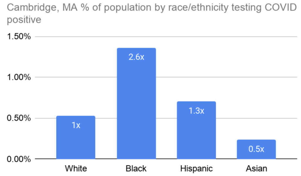
Takeaway 1: Black people in Cambridge are testing positive at least 2.6x more often than white people.
And it could be even worse than that, given the incomplete dataset. This finding echoes trends from cities around the country and is unsurprising given the racial disparities that impact Black Americans across almost all public health outcomes. Figure 1 below shows the percentage of people in Cambridge within each race/ethnicity who tested positive for COVID-19. So, for example, based on the 2020 census estimates, 0.5% of the white population, and 1.4% of the black population in Cambridge thus far have tested positive for COVID-19. This is despite there being six times as many white people as there are Black people in Cambridge.
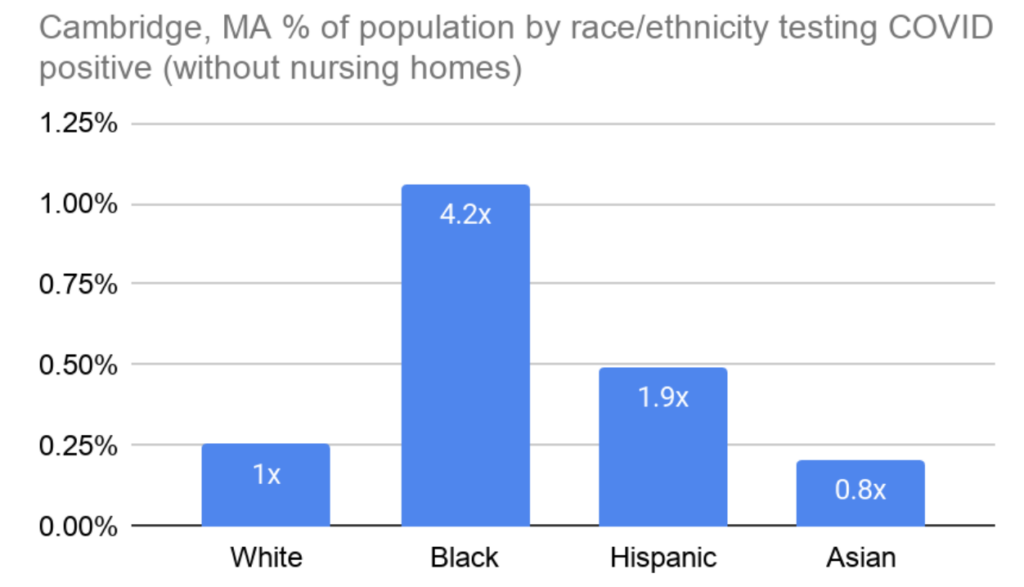
Outside of nursing homes the contrast is even starker: Black people test positive 4.2x as often as white people in Cambridge, and Hispanic people nearly twice as often (Figure 2).
The City has not released data on deaths by race & ethnicity, but it is reasonable to assume that Black people are disproportionately dying from COVID-19, as well. I asked for more testing & resources for Black and brown people in Cambridge through a policy order on May 4, an effort that was joined by Councillor Simmons’ more direct request for testing in the Port. The localized testing is now happening, but there is essentially no other effort by the City to directly counteract these disparate racial impacts.
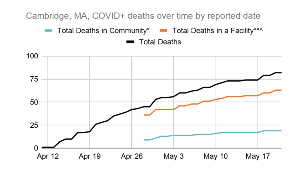
Takeaway 2: The case fatality rate in Cambridge nursing homes is alarmingly high: 24% as of May 22.
The case fatality rate is the number of people who ultimately died after testing positive, expressed as a percent of the total number of positive tests within the population. Nearly a quarter of those who tested positive in Cambridge nursing homes and long term care facilities have passed away, as of late May. For comparison, the case fatality rate for Cambridge residents outside of these facilities is 3%. Figure 3 shows deaths over time as reported by the city (we didn’t get data specific to nursing homes until April 27). It is great that we’ve done so much testing in our nursing homes, but a case fatality rate this high needs more scrutiny. We need to better understand what happened and how it could have been prevented or mitigated so that we are better prepared next time.
Takeaway 3: The number of new cases per day declined steadily in the second half of April, but there was a slight uptick in early May.
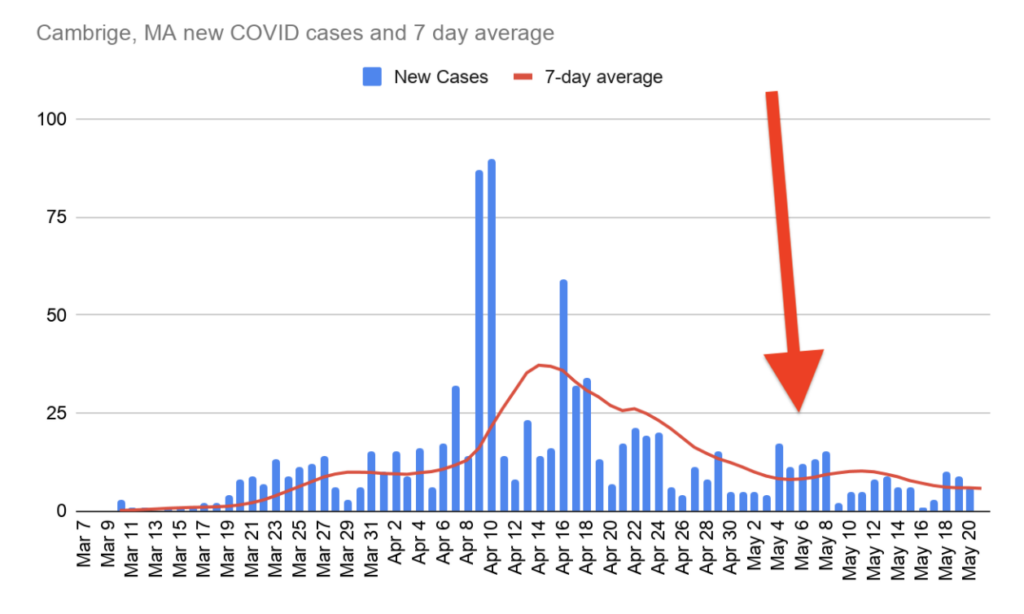
The City’s testing facility in East Cambridge, which allows any Cambridge resident to get tested, did not open until May 8. The Public Health Department says the uptick is correlated with increased outreach about testing availability. Either way, more positive tests mean the virus remains out there and is still spreading within the community. The uptick could also be due in part to generally improving weather over the course of April, leading to more people leaving their homes.
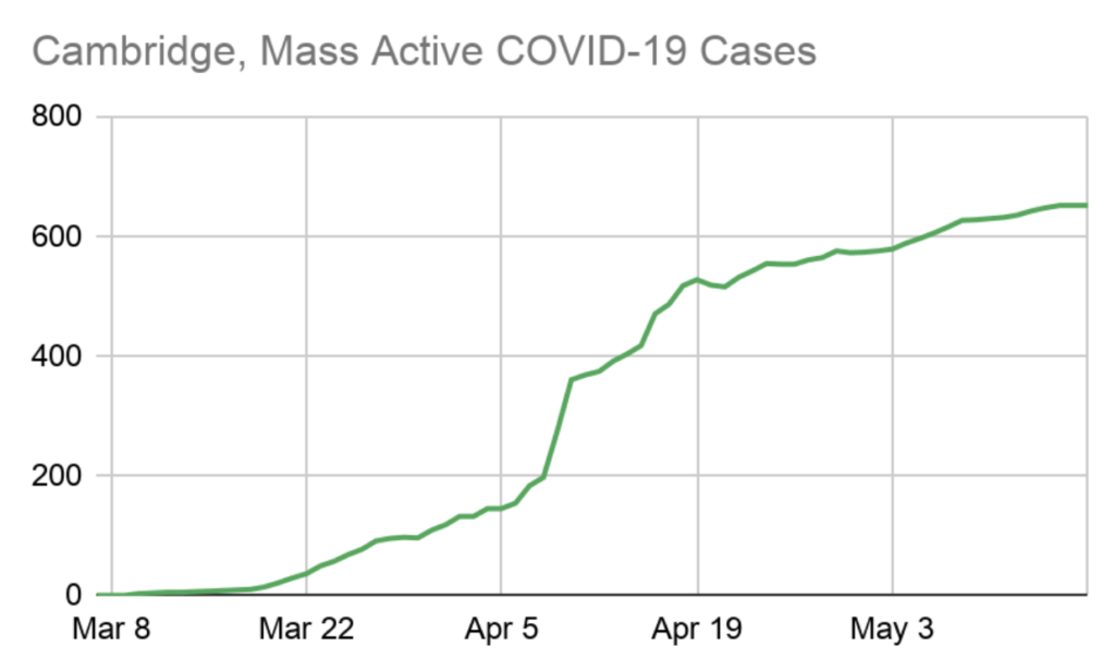
Takeaway 4: The active caseload is still steadily increasing.
Active caseload is the total number of positive tests, minus recoveries and deaths. Deaths are not necessarily reported on the date they happen, but recoveries and positive tests are. So the active caseload is a reasonable approximation of how many people have yet to recover (or perish) from the virus.
This figure is, of course, correlated with demand on our healthcare system. We want to see an active caseload that is declining despite the inevitable new cases added every day, which would mean recoveries are beginning to outnumber new cases. The brief peak you see around April 19 reflects nursing home testing. The city officially shut down on March 19.
Until we see a steady decline in the active caseload, it doesn’t seem prudent to begin re-opening our economy. Unless we’re just not properly recording deaths and recoveries, an increasing caseload means we’re still seeing community spreading of the virus, and reopening the economy would only make that worse!
Also, clearly, we need to know how many people were tested on each day, not just how many tested positive. Without the total number of daily tests, we can’t determine whether the new cases are simply the result of more testing, or actually a signal that the infection rate is increasing again.
Takeaway 5: Cambridge’s death rate is much lower than New York City’s, but San Francisco’s is much much lower than ours.
The death rate is the number of people who died from COVID, divided by the total population. It is more useful than the case fatality rate for making comparisons between cities because it is less affected by differences in how many people were tested within each city since we are comparing across the entire population, not just those who tested positive.
It still isn’t perfect, because not every cause of death is known, and the number of deaths attributed to COVID-19 is almost certainly higher than what we see in this data. But presumably, excess un-reported deaths from COVID-19 are roughly proportional to COVID-19 reported deaths in each city. NYC provides the number of reported deaths from COVID-19 that were not confirmed with a positive COVID-19 test. That number is included in this graph and contributes about 20% of the COVID-19 deaths in NYC. Similar adjustments in the other cities would not make a huge difference to this graph or the conclusions drawn from it, however.
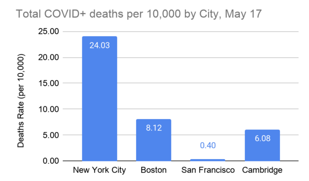
San Francisco was the first to do shelter in place, and its public transit system is much less robust than ours is. They were also out front on critical public health policies like street closures and providing hotel rooms for unhoused people. Creating space for people to safely social distance outdoors and providing safe isolation space for those with nowhere to go has likely played a role in San Francisco’s low death rate.
California overall has a similarly low death rate, while New York and Massachusetts were hit hard. So it is possible that the pandemic was seeded more robustly on the east coast, via European travel, than it was on the west coast. If so, blame for that falls squarely on Federal authorities for not more immediately shutting down international travel upon learning of the virus.
Takeaway 6: Women represent almost 60% of cases in Cambridge.
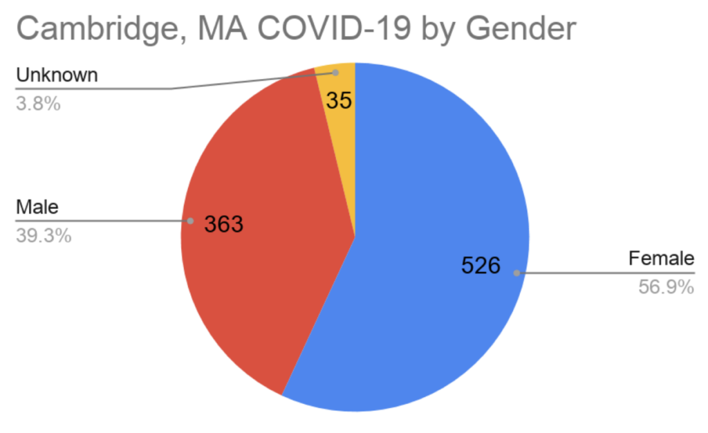
There is no clear explanation for why this is, but one possible explanation is that COVID-19 has a high prevalence among the elderly, and women are slightly longer-lived than men. Therefore, women may be overrepresented slightly in positive tests for COVID-19. This trend mirrors the statewide trend as well.
Thanks for teasing out these points and need for specific metrics.
I wonder how the availability of housing for covid-positive residents affects the rates of new cases. Are there statistics on percentage of health workers testing positive?